Wednesday 27 April 2016

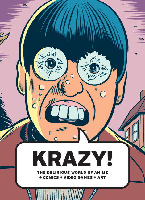
Book Review - KRAZY!

I took a book out of the library that I have been looking at just to explore different areas of the industry and this book explores anime, comics and video games. One of the things that I enjoyed about looking at this book was that it had so many examples of different artists to look at and this is something that is sometimes hard to find when you just want some easy inspiration. Even though the book says that it looks at anime on the cover it has actually a lot of really cool illustrative artists that have really fun work.


Below I am going to discuss a few artists that I liked in the book!


PHILIP GUSTON

I liked this illustrator because of his very detailed yet messy style, which I thought was fun and stood out to me. His work is quite abstract and tells a story in only a drawing and I love the comedic style he uses in his art.


LOTTE REINIGER

This artist was one of the most different in comparison to the rest of the book and I liked her because of this. Her work is cut out and she uses silhouette animation which I find really interesting! Silhouettes are something that I would love to try in the future and her work is really detailed and beautiful to me. Below I have put one of her animations and watching this kind of animation that created quite a while ago is so inspiring as it is still great and really well done. I love the different layers she uses and the style of the cut out where each part is connected.


MOYOCO ANNO

This last artist is a manga artist, and I don't normally go for manga as I prefer different styles, however when I saw her work I thought it was beautiful and not the normal manga style. I like it because her drawings of characters are a little more realistic rather than cartoonish and I really love the colours and the way she paints her manga. As you can see below her characters are really detailed and this is something I always love in artwork. I feel like she uses watercolour to create her pieces but I'm not too sure, anyway the colours are great.


Tuesday 26 April 2016

Only Yesterday - Studio Ghibli - US Release

Only Yesterday is an old animation, but it is only just being released as a US version! This just shows me how animation is timeless and even though this animation is around 25 years old, watching the trailer you would think that it's brand new. I absolutely love Studio Ghibli's art style and I love how they are so great at creating emotion with their characters and their beautifully painted backgrounds, I feel like they make the audience want to be there too and this is a really great as an animation as it really takes the viewer into a different world.


I have put below a few different scenes form the animation that I really liked and they really inspire me to create my own backgrounds that are of high standard like Ghilbi's. When so much effort is put into the scenes it makes the world that the animation is set in feel more real and like it's an actual place. I have done a little research into Ghibli's backgrounds before and I found Miyazaki likes to base a lot of his worlds of places like Italy and is completely in love with England so that might be why some of his settings are very green and feature lots of farming and fields like the second image and some are very warm and feature a lot of the ocean like places like Italy.


Anomalisa!

"Anomalisa" Trailer from JoePassarelli on Vimeo.

This animation excites me so much! A lot animation that is created for film is usually made for children or a young audience and especially stop motion where we see films like Coraline ect. I absolutely love film and to know that film and animation is now coming together to create a more serious genre is really exciting to me. I understand that some people don't see animation as a serious genre, however with films like this coming out I feel like it will start to inspire more people to love it as an art form or to create more serious animations that can be taken seriously by the film industry. This is the first ever stop motion to feature a sex scene and it may be bizarre and a definitely out of the ordinary, but to me this is just another stepping stone into the idea that animation is evolving! I have not yet got to watch this film but I am awaiting the day for it to come out so I can watch it, maybe I'll write another blog post once I have because I can't wait! I really love how they have used only one voice actor for every character and one other one for the female character, I feel like it makes the animation really personal and after reading a lot of reviews on it, it has been said how emotional and great this film is.

Skyfall Title Sequence - VFX

I wanted to look at a more technical side of animation that can be used in a 3D aspect as I haven't really looked at much of this. I looked at the Skyfall title sequence, which features a lot of scenes that are very surreal and as it's such an iconic film series I thought it would be a great modern example.


Skyfall - Opening Title Sequence from Best Of Cinema on Vimeo.

Even thought a lot of the scenes are beautifully put together, I do think that the soundtrack in this title sequence really is what brings it all together and without it, it definitely would not be as effective. This really shows how important your soundtrack can be and possibly even better to decide on this before you go into production. Below I have put a few stills that I really liked in this sequence and I like them because they are scenes that couldn't exist without 3D animation. They are really detailed and also show how realistic you can make animation feel even though it has been created through a computer. This is something that I am not really interesting in pursuing in the future, however I still think that it is important for me to look at the current industry to see what is out there.


The Art of the Title - Down the Rabbit Hole 2016

The Art of the Title is a website I am really new to and had never really heard of it before but now I absolutely love it for inspiration! I found a title sequence for Down the Rabbit Hole which is a Dutch festival and I really loved this title sequence because it's really detailed and psychedelic and this is something which I think would be really hard to animate.

Down The Rabbit Hole 2016 from Agent Pekka on Vimeo.

The transitions used here are really beautifully done and the use of colour has been really thought through, I feel like it would be easy to use so many colours and take away from the shapes and the action in the animation but here they managed to not do this. I particularly like the scene where it turns into a floating cloth. Below I have put the ideas and concept art they had for this animation and I really love looking at this kind of thing because it would take such a long time to plan this kind of animation.


Building Puppets in Animation


I watched this short documentary about building puppets and I found it really interesting and found out a lot that I had no idea about before. Building puppets and creating animation this way I found would be a really cool method and I really enjoy filming live footage as I love filmmaking. I would really want to try this method one day and I don't have the same high quality materials that they have in this video, I could maybe take the tips such as having a flat mouth which can be covered by hair or pieces of foam and create my own equivalent. However, in tho video he explains that you may think they use really good tools to create the puppets, but he explains that they don't really use that many tools and mainly use their hands and scissors. I have seen them here use foam, wire, beads, cardboard, cement used to glue shoes and material for the fur of the characters. They also use patterns and keep them so that they can replicate puppets again and again for when they cut the foam and this is really clever so that if something happens to your puppet or you can to make another one with a similar structure you don't have to start from scratch again. These puppets seem to be mainly made out of foam which is all glued together and I really loved watching this to find out more about puppets which we may not get to really cover that much.

Claymation!

In animation I really love the idea of stop motion and favour it over over methods so I wanted to look at claymation which is a form of stop motion. I have never really seen in detail how they animate clay but I have had the experience so far of creating my own clay model, but I didn't get to animate with it.

Sonos - Claymation from 1stAveMachine on Vimeo.

I really liked this example of claymation because it was different from the usual character and narrative animation, and instead uses claymation to create a different effect. I think this kind of animating shows how animation doesn't have to always be used in this way and can be used in different ways like this one. I love how they use pastel clay to make all the different flowers and it makes for a really stunning animation.


Morphology from Peter Sluszka on Vimeo.

This is yet another animation where I really liked it because it was different. The effort that must have gone into this animation is unreal and I would really love to see the making of this video! I like it because of the super detailed form that the clay goes through and you can see that the time was really taken to create this little clip. This kind of ting inspires me to experiment more with clay because of the fact that you can literally create anything out of it and it can morph and move in ways that no other material can.


Share The Joy. Répandez la Joie. from SHED on Vimeo.

Finally, I just waned to share this one because I thought it was quite cute and had a nice narrative. This kind of claymation shows how you can create your own little world and characters in it and I like this animation because it really made good use of characters and the emotion they are feeling throughout. As the characters keep swapping legs this is something that is really easily created in claymation and it shows again the kind of wacky things you can do with this medium.

Monday 25 April 2016

Cut Out Animation

Looking at different techniques in animation is something that is really important if I want to think about the different ways I can approach future projects and the more I learn about and know the more I will be able to try. Cut out animation is something that has a few different ways of achieving it and I wanted to look at the different methods and how effective they are.

The first method is the standard cutting out bits of paper and moving them each time and taking a series of photographs. This way is quite old but it still works really well and I looked on vimeo for a few examples of cut out animation that have used this method. I found a really interesting behind the scenes video of this method and I wanted to share it just because I think it's sometimes useful to see how they've done it to get a better understanding. Something I personally really enjoy is to paint and after watching this video I saw how the animator paints her characters such as the bear and then cuts them out so I'd really like to try this method in the future! I also found it interesting how to move the really little parts of the characters with a toothpick and I've never really considered how careful you have to be with each tiny layer.


I found this animation and I thought it was a really cool use of cut out along with using a stop motion setup and feel to it. I really like how in some scenes they have the paper moving like it's blowing in the wind. It's also really stylised in the way that it uses a black backdrop and then colourful layers on top that really pop and stand out, this is a really nice look and they don't really try to hide that it's all cut out pieces of card either. In most cut out animation it is usually quite flat and 2D looking but I thought this animation was great as it uses paper as a prop and makes 3D objects from paper. I also really like the sue of real time footage that they use and I feel like it makes the whole animation seem more real.


Early Morning Life : Paper cutout animation from S A R A N yen P A N Y A on Vimeo.

Concept Art in Animation

Something that I am starting to get really interested in is the different ways that you can create and design a whole world and the characters that live in it. I particularly have start to enjoy drawing up all the different backgrounds and making them in different styles digitally. As digital painting is something that is very new to me I wanted to have a look at different concept art for famous animations to see how they had originally looked at the idea.

First I thought I would look at a modern example; Kung Fu Panda 3!


I really love the character sheets for this animation, mainly because they are really expressive and it really show the volume of this character. I like how they have him not only in different action positions, but also like he is reacting to something and it really brings him to life.


This is a concept of a place in the animation and I thought this was absolutely gorgeous, the colours are so bright and I really want to be able to create worlds like this of my own someday.

Next I looked at Yellow Submarine, the Beatles animation which I wanted to look at because it is such a lovely colourful animation that is quite different and crazy.


 I also thought this was an interesting animation because they had to design characters that looked like real people and I found that they did a really great job of capturing each other the band members.


 Here is a little concept piece that was created for the animation and I really like the style here of the different layers. It really looks like each drawing is on a different layer and is put on top of each other and I want to maybe look into how I can create this same effect possibly using a digital method.


Copyright!

One of our seminars was all about copyright and I am going to go over what I found out, which was helpful in the way that I can start to understand how copyright could apply to my own artwork.

Important Points: 


  • Author has a right to protest if their work is defamed or changed
  • Copyright can be transferred, or sold to another party - they need to be legally transferred
  • Copyright can go out of date (Life +70 years)
  • To gain permission - contact the owner directly or contact the organisation or company who represents them
  • You don't always have to ask for permissions but it's crucial if it's for commercial use
  • Non-commercial, educational, research or private study does not require permission

Alternatives to Copyright

  • Copyleft - A for of licensing and can be used to maintain copyright conditions for works such as computer software, documents and art - an author may give every person who review a copy of a work permission to reproduce, adapt to distribute it
  • Creative Commons - non-profit organisation that provides a legal framework to allow people to share and remix legally
  • Attribution by CC - Lets others distribute, remix, tweak and build as long as they credit you
  • Attribution Share Alike - Like copyleft
  • Attribution No Debrivs - Allows redistribution as long as it is passed along unchanged and credits you
  • Attribution Non-commerical - Others can change and use your work but can't make money from it
  • Attribution Non-commercial Share Alike - Other can change your work but cannot make money from it as long as they credit you too
  • Attribution Non-commerical NoDebrivs - No money can be made, no changes and they have to give you credit
Previously, I did know a small amount about copyright due to studying Media Studies, however I definitely didn't know there were so many types! I think that it's really important to know about these different ways to protect your work and protect yourself from facing copyright issues in general. I also found it rally interesting how you could post your work to yourself that has been dated and this is proof you created it first as I had no idea that you could even do that as a way to cover yourself!

Saturday 23 April 2016

Elliot Lim


 Elliot Lim I found through watching the PPP presentations and he is an artist that I had actually never heard or seen of before! I was really attracted to his work when I first saw it so I really wanted to do a little more research on him and look at his work further. He is a freelance director, designer and animator and I liked his work before of the minimalistic style and his use of transitions in his animations that I thought were so creative and clever. 


Something that I am passionate and love is creating and designing backgrounds and after looking at Elliot Lim's animations I wanted to look more at his static work. Below are a few of his pieces that I thought were beautifully done.

6ebd2230524905.5626eef9121fa.jpg


64e0bd30524905.5626eef9142a5.jpg

97aed630524905.5626eef90ffe8.jpg


The reason I really like these scenes are because they are really minimal and use very simple shapes to form the scene, however there is still a lot of detail in them too. The grass in the first image is almost square and sharp, but this style is really appealing to me as it's very modern and sleek-looking. I also really liked the colour palette that has been used in these scenes, I feel the greens, blues and greys work really well together and in keep with the style of drawing. These scenes have been created digitally and this is something that is quite new to me as I have never drawn digitally before coming to university, so looking at other digital artists is helping me think of new ways that I can explore the way of drawing.

b8d19630524905.5626eef90b925.jpg

Chloe Batchelor

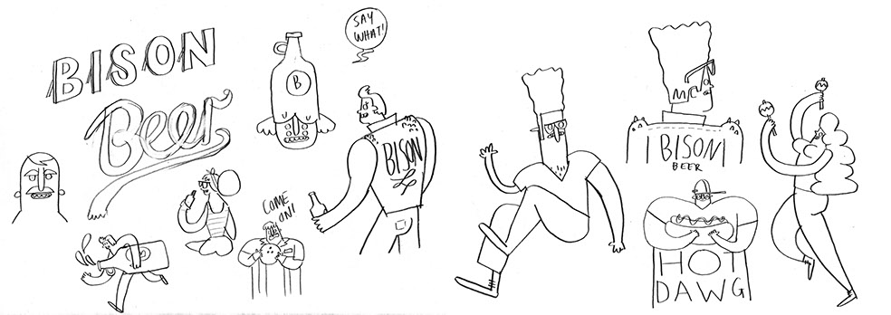
Chloe Batchelor is an illustrator, animator and director and I really loved her work when I first saw it as it was so fun and vibrant! She is really great at designing different characters and this is a skill that I think I could improve in my self, so looking at inspiring artists such as Batchelor is great for research.

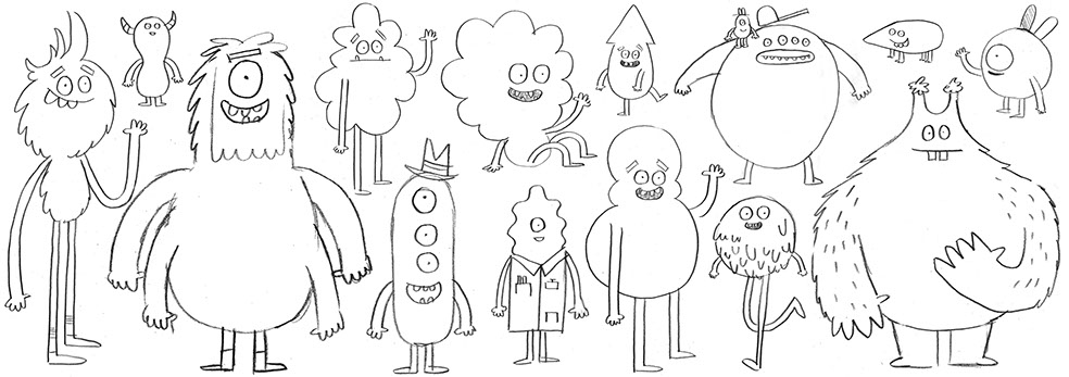
I looked at some of her sketches instead of just looking at her final pieces so that I could get some inspiration for my sketchbooks and her designs are really simple yet full of character.


I really like how she mixes up her shapes and sizes in the sketches and doesn't just stick to one style, these sketches I thought were really fun and when looking at other styles in the industry this seems to be quite popular. Below I have put another example of her sketches and I think they are so simple yet original, I really want to work on creating my own characters that are as silly and fun as hers. I have found she uses very simple hands and feet and this is also something I prefer as they aren't something I enjoy drawing in general!


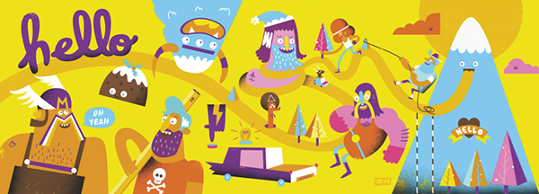
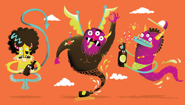
Here are a few of her official pieces and I love the bold colours and colour schemes that she picks out as they seem to work really well wth the simple shapes she uses. The colours she uses aren't the generic colours that you would use, for example blue or purple hair, yet they make her art seem more much appealing and eye catching.


Finally, what I have notices about her work is the spray effect she uses to create shadow and I think this is a really effective way of adding shadows that aren't too harsh so this could be something that I try out for my self.